Lozenges
Lozenges highlight an item's attributes or status so it can be recognized quickly.
Anatomy

A) Container B) Text label
Sizes

Lozenges come in 2 sizes for use in different applications. • Small • Medium
Positioning
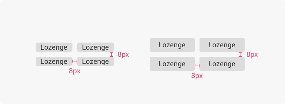
Lozenges placed next to each other in a sequence or stack should be spaced 8px apart.
Variations
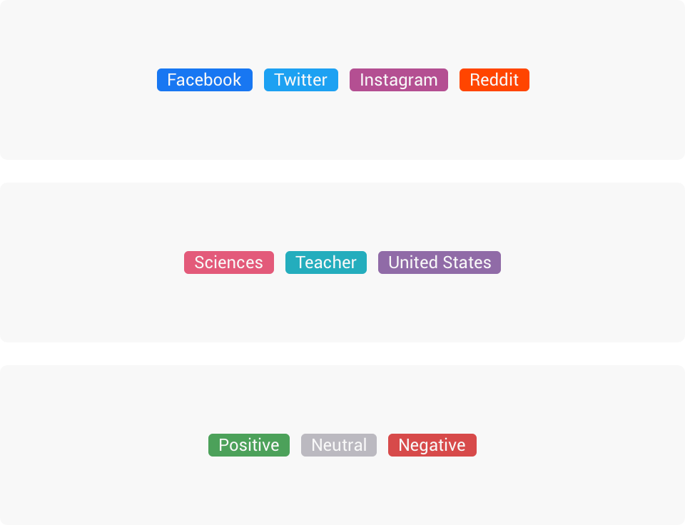
Attribute Lozenges
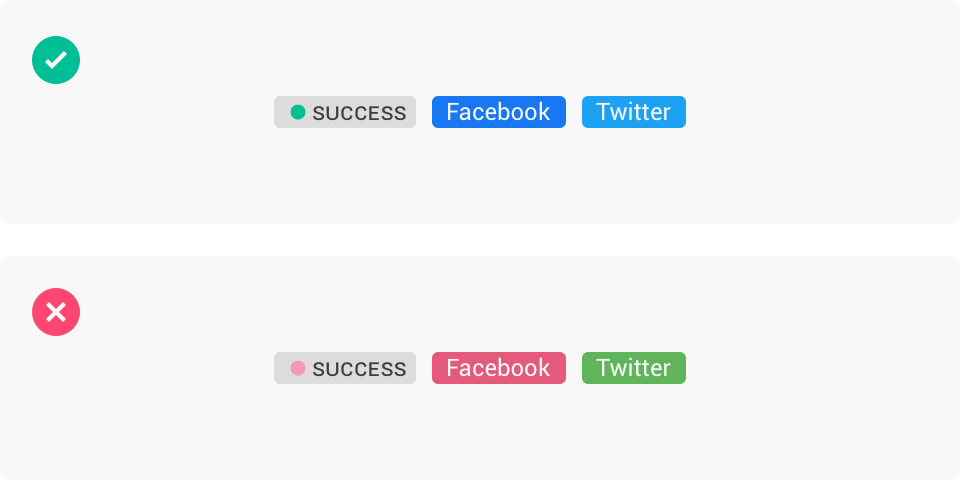
Attribute lozenges highlight an item's attributes. Color is used in a meaningful way to aid quick regonition across related themes such as: • Content sources – using the [social network colors] and [page type colors] sets • Interests, professions and locations – using the [curated product colors] set • Sentiment using the [sentiment colors] set

When there isn't any unifying themes (e.g user defined tags or categories) use the default style attribute lozenges.
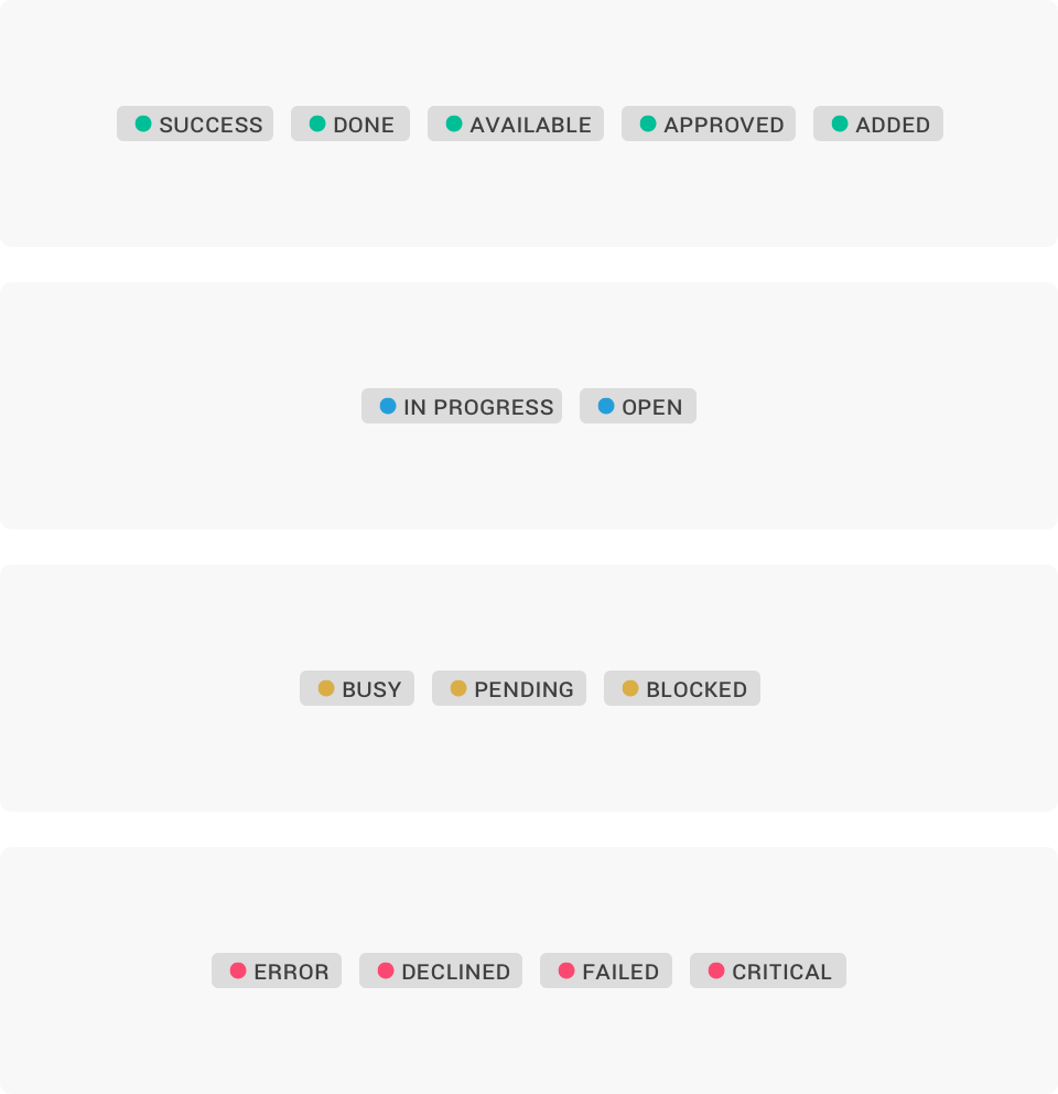
Status Lozenges
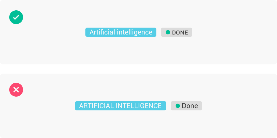
Status lozenges highlights the status of a process undertaken by the user. These lozenges use uppercase labels and feature a status dot using the [attention color] set. There are 4 status sets: • Success: Completed successfully (e.g success, done, available, approved, added) • Info: In progress or open (e.g in progress, open) • Warning: requires attention (e.g busy, pending, blocked) • Error: encounted a problem (e.g. error, declined, failed, critical).

Spinner Lozenges
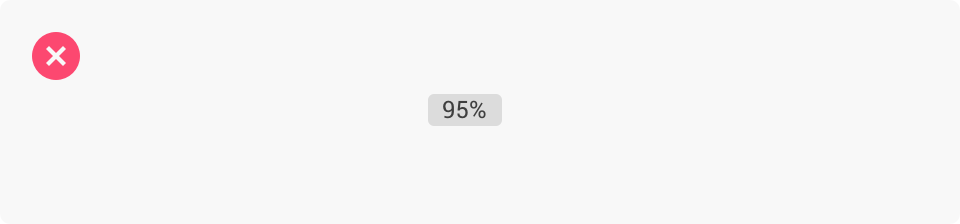
Use the spinner lozenge to let users know that item’s status is being processed and may take an indeterminate amount of time.
Best practice
Lozenges vs badges
Do not use lozenges to show counts or numerical figures. Use badges instead.
Colors
Use color in a meaningful way to aid quick recognition of a particular attribute or status.
Overflow
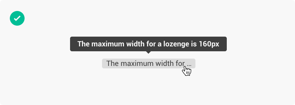
The maximum width for a lozenge is 160px. When the lozenge text exceeds the max width, the text will be truncated with ellipsis.
Label case
Attribute lozenges use sentence case. Status and spinner lozenges use uppercase. Do not mix the two different approaches.
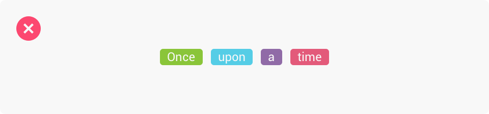
Don’t be evil 👿
Please never do this.