Breadcrumbs
Breadcrumbs help users understand where they are in a nested hierarchy and allow them to navigate up to the parent levels.
Anatomy
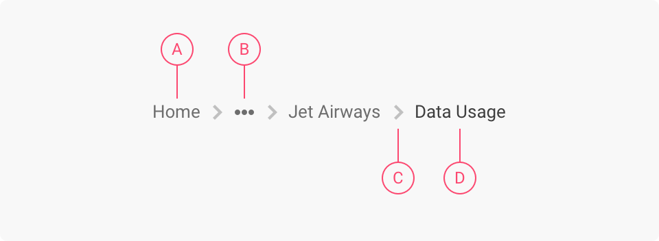
A) Parent page link B) Ellipsis (conditional \[Link to Variations > Long Breadcrumbs]) C) Separator D) Current page label
Behavior
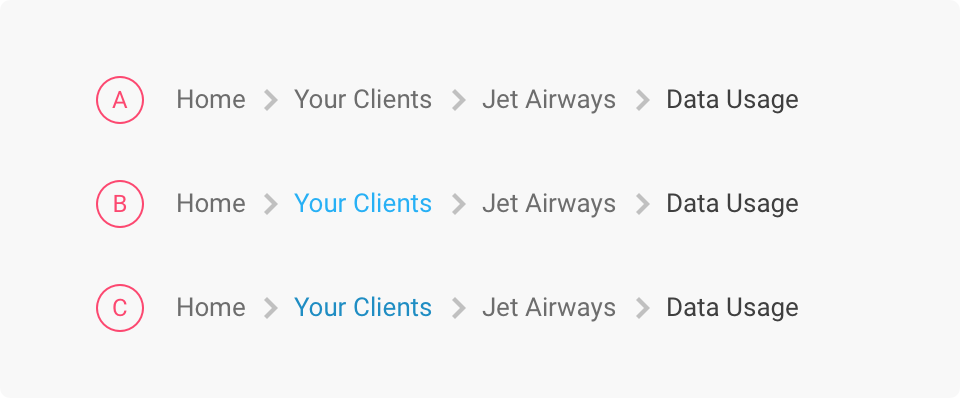
Breadcrumbs use quaternary links \[Link] to allow the user to navigate to the parent pages. Parent page links have three interaction states: A) Default B) Hover C) Active
Sizes
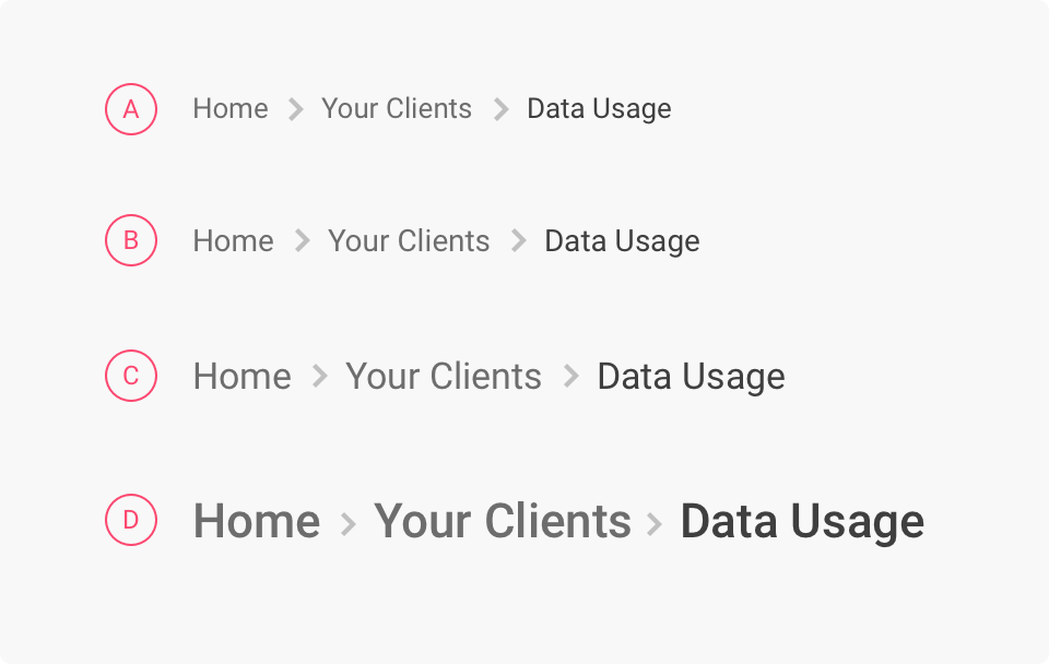
Breadcrumbs come in four sizes to match with the type scales: A) Body B) Body large C) Headtitle D) Headline
Spacing
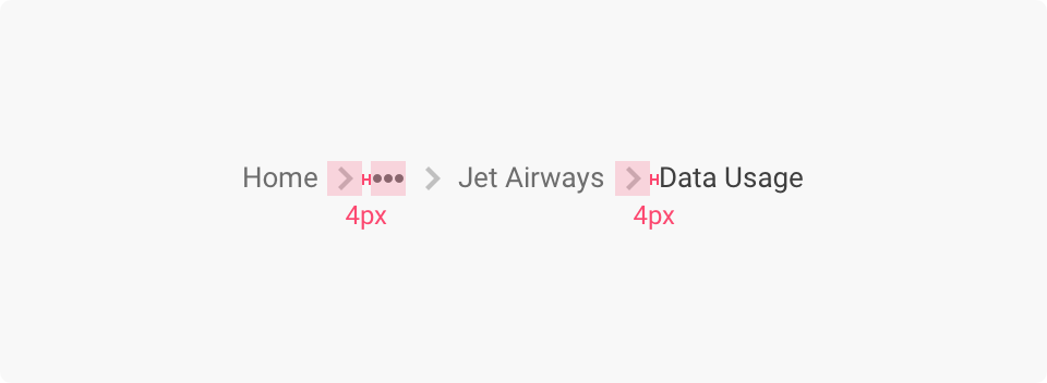
The distance between a link/icon/label and a separator should be 4px.
Variations
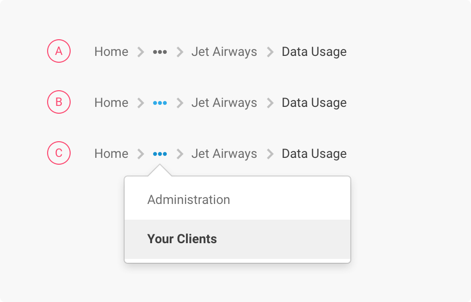
Breadcrumbs with a large number of levels can auto-collapse using ellipses to reduce screen clutter. This is useful when space is tight or for responsive designs.\ The ellipsis icon button \[Link] triggers a contextual menu containing the collapsed links. It has three interaction states: A) Default B) Hover C) Active
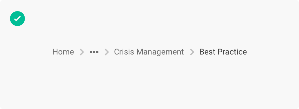
Best practice
Links/Labels case
Do not use uppercase in breadcrumbs labels.
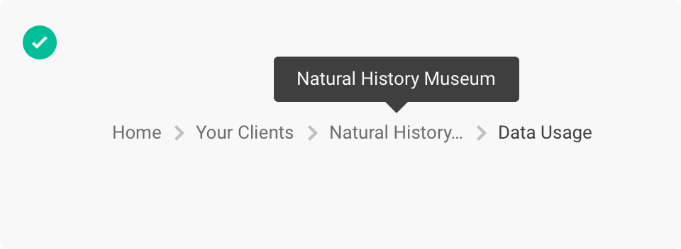
Long links/labels
Breadcrumbs with long links/labels will be truncated and rely on an ellipsis tooltip \[Link] to show the entire string.

Current page
Do not use a link to represent the current page.
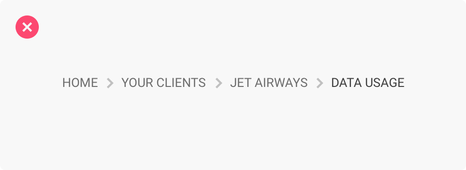
Long breadcrumbs
Do not wrap breadcrumbs to multiple lines.
Instead use the ellipsis button icon \[Link].

History vs hierarchy
Do not use breadcrumbs to show the user's history. Showing the actual steps the user took to get to the current page will not provide any benefit to the user and will create confusion.

Breadcrumbs should always show the hierarchical structure.
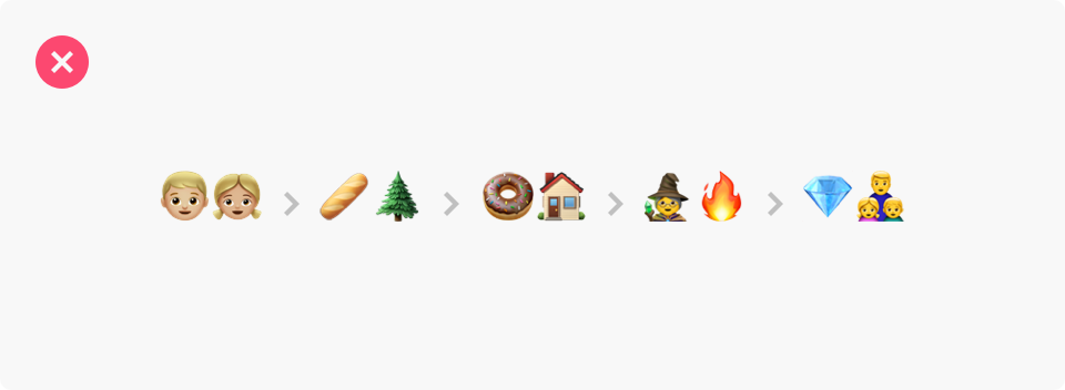
Don’t be evil 😈
Breadcrumbs originate from fairy tales, but that's a different kind of storytelling. Please don’t do this.